Use these posters to guide the way you share information online and in print.
Karwai Pun is an interaction designer currently working on Service Optimisation to make existing and new services better for our users. Karwai is part of an accessibility group at Home Office Digital, leading on autism. Together with the team, she’s created these dos and don’ts posters as a way of approaching accessibility from a design perspective. Read the original article here. Article content copied below.
The posters
The dos and don’ts of designing for accessibility are general guidelines, best design practices for making services accessible in government. Currently, there are six different posters in the series that cater to users from these areas: low vision, D/deaf and hard of hearing, dyslexia, motor disabilities, users on the autistic spectrum and users of screen readers.
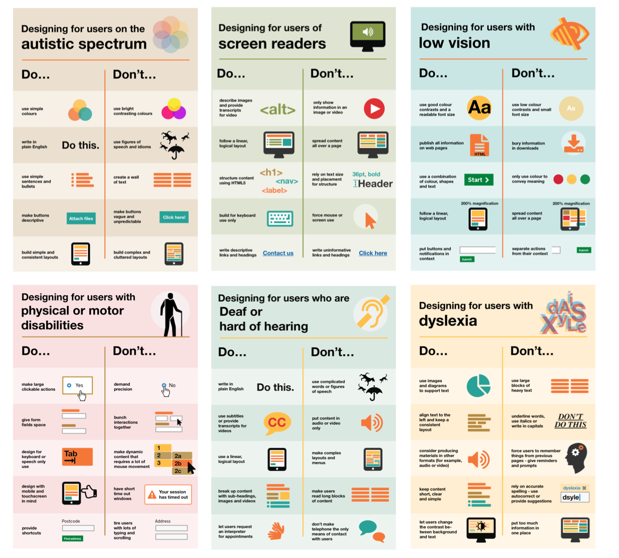
Caption: Preview of posters showing the dos and don’ts of designing for users with accessibility needs including autism, blindness, low vision, D/deaf or hard of hearing, mobility and dyslexia. Continue reading for links to full printable posters as well as posters translated into different languages.The dos, that run across various posters, include using things like good colour contrasts, legible font sizes and linear layouts. So, aren’t good design principles applicable to everyone and not just those with access needs?
While this is true, the aim of the posters is to raise awareness of various conditions through good design practice. We need to be mindful of not just designing or building for our own immediate needs. For example, consider designing for keyboard use only. This is particularly helpful for users with motor disabilities where using the mouse can be quite difficult, especially with precise movements, whereas keyboard use is much easier.
Another aim of the posters is that they’re meant to be general guidance as opposed to being overly prescriptive. Using bright contrast was advised for some (such as those with low vision) although some users on the autistic spectrum would prefer differently. Where advice seems contradictory, it’s always worth testing your designs with users to find the right balance, making compromises that best suit the users’ needs.
The team
The content for the posters came from our accessibility team in Home Office Digital. Led by accessibility leads Emily Ball and James Buller, we are a group of twelve, each specialising on these conditions: blind and visual impairment, dyslexia, autism and ADHD, D/deaf and hard of hearing, mental health and motor disabilities. Collectively, we learn as much of the conditions as we can to better increase our knowledge so they can be shared within and outside the team.
One of the challenges we faced with the posters was gathering information from our different specialisms and reducing the vast amount of knowledge to ten principal dos and dont’s. There’s also challenges surrounding content and graphics. I worked with Nick Cowan, a content designer, who is leading on motor disabilities, to keep the content concise and ensure the graphics visibly represented the advice accurately.
Next steps
We’ve shared these posters across government for feedback and they can be found on GitHub.
We are constantly improving and adding to them so please let us know what you think. Understanding accessibility through design means we can build better services for everyone, whatever their access need.
Update: We’ve been asked whether these posters can be reproduced or translated into other languages. In keeping with the the GDS ethos of making things open, we’ve used a Creative Commons license which allows everyone to share, use and build upon the posters provided they are used non-commercially and keep the appropriate attributions (Home Office, Home Office Digital and the Creative Commons logo). It would be great if people can share photos of them being used on Twitter and can commit translations of the posters to our GitHub repository so they’re available for everyone.
What the posters say
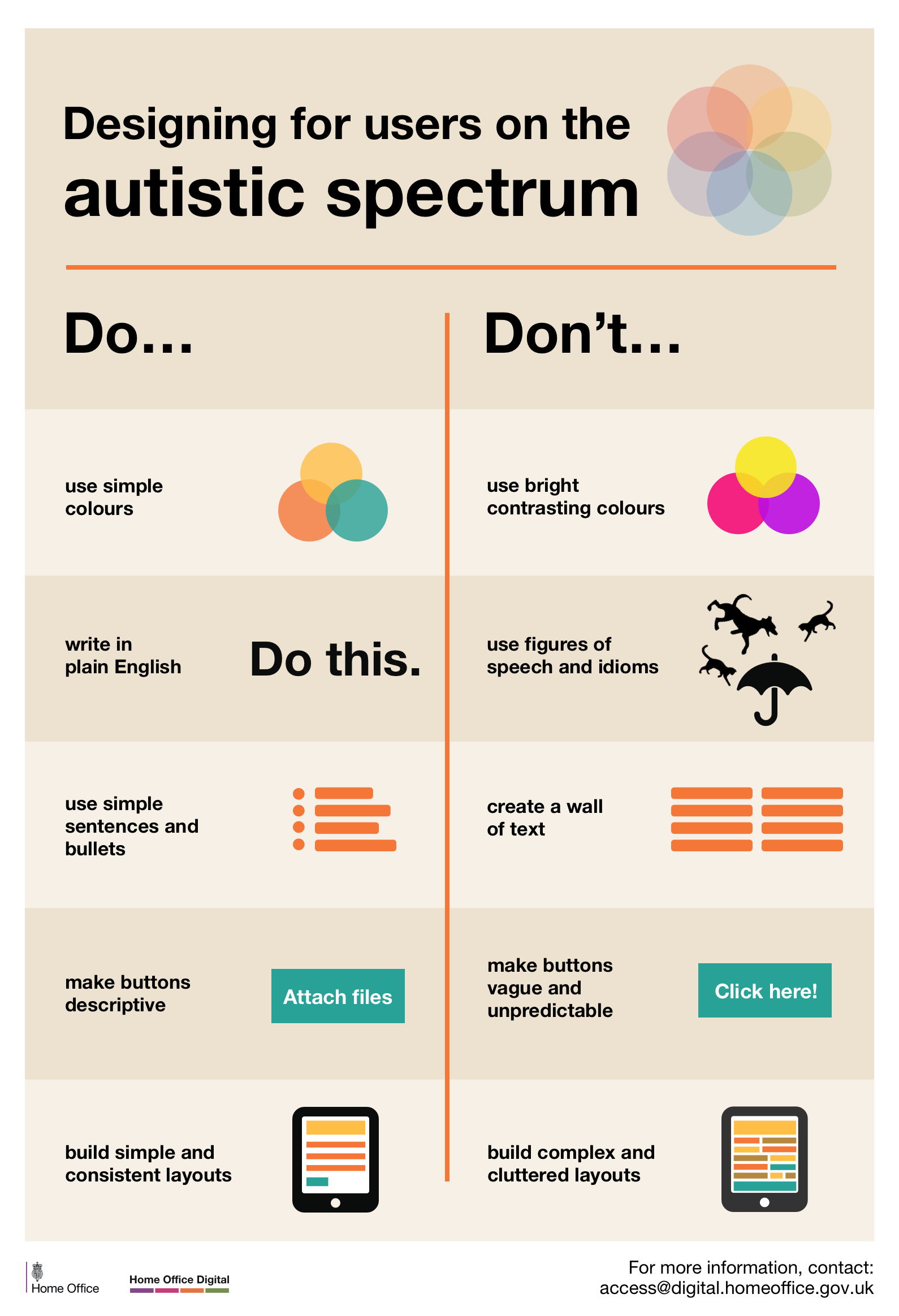
Designing for users on the autistic spectrum
Do
- use simple colours
- write in plain English
- use simple sentences and bullets
- make buttons descriptive - for example, Attach files
- build simple and consistent layouts
Don’t
- use bright contrasting colours
- use figures of speech and idioms
- create a wall of text
- make buttons vague and unpredictable - for example, Click here
- build complex and cluttered layouts
View poster for the autistic spectrum
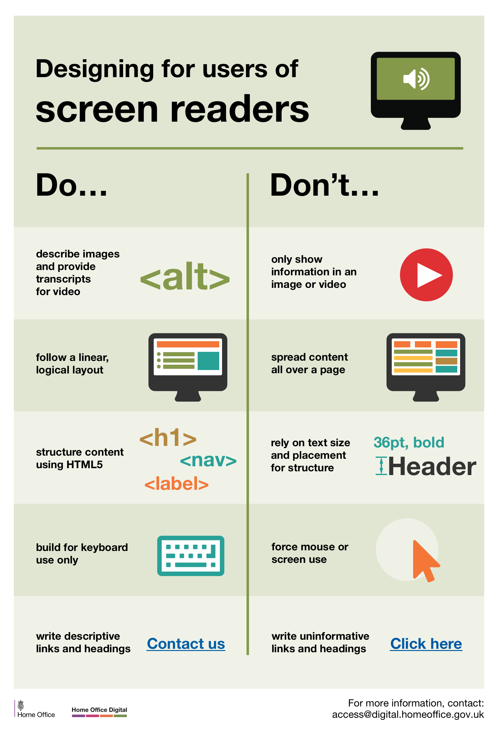
Designing for users of screen readers
Do
- describe images and provide transcripts for video
- follow a linear, logical layout
- structure content using HTML5
- build for keyboard use only
- write descriptive links and heading - for example, Contact us
Don’t
- only show information in an image or video
- spread content all over a page
- rely on text size and placement for structure
- force mouse or screen use
- write uninformative links and heading - for example, Click here
View poster for screen readers
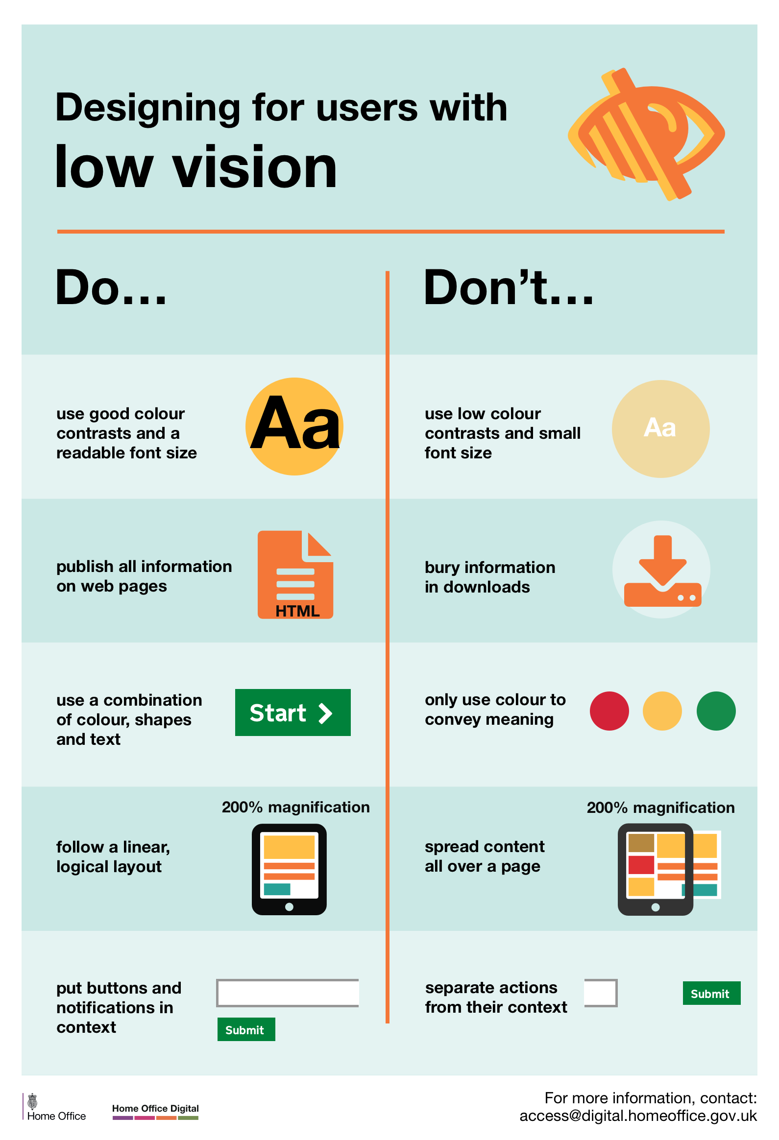
Designing for users with low vision
Do
- use good contrasts and a readable font size
- publish all information on web pages (HTML)
- use a combination of colour, shapes and text
- follow a linear, logical layout -and ensure text flows and is visible when text is magnified to 200%
- put buttons and notifications in context
Don’t
- use low colour contrasts and small font size
- bury information in downloads
- only use colour to convey meaning
- spread content all over a page -and force user to scroll horizontally when text is magnified to 200%
- separate actions from their context
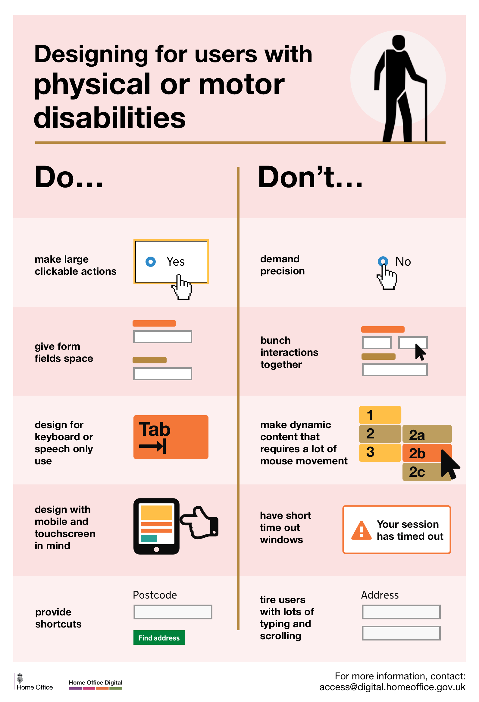
Designing for users with physical or motor disabilities
Do
- make large clickable actions
- give form fields space
- design for keyboard or speech only use
- design with mobile and touch screen in mind
- provide shortcuts
Don’t
- demand precision
- bunch interactions together
- make dynamic content that requires a lot of mouse movement
- have short time out windows
- tire users with lots of typing and scrolling
View poster for physical or motor disabilities
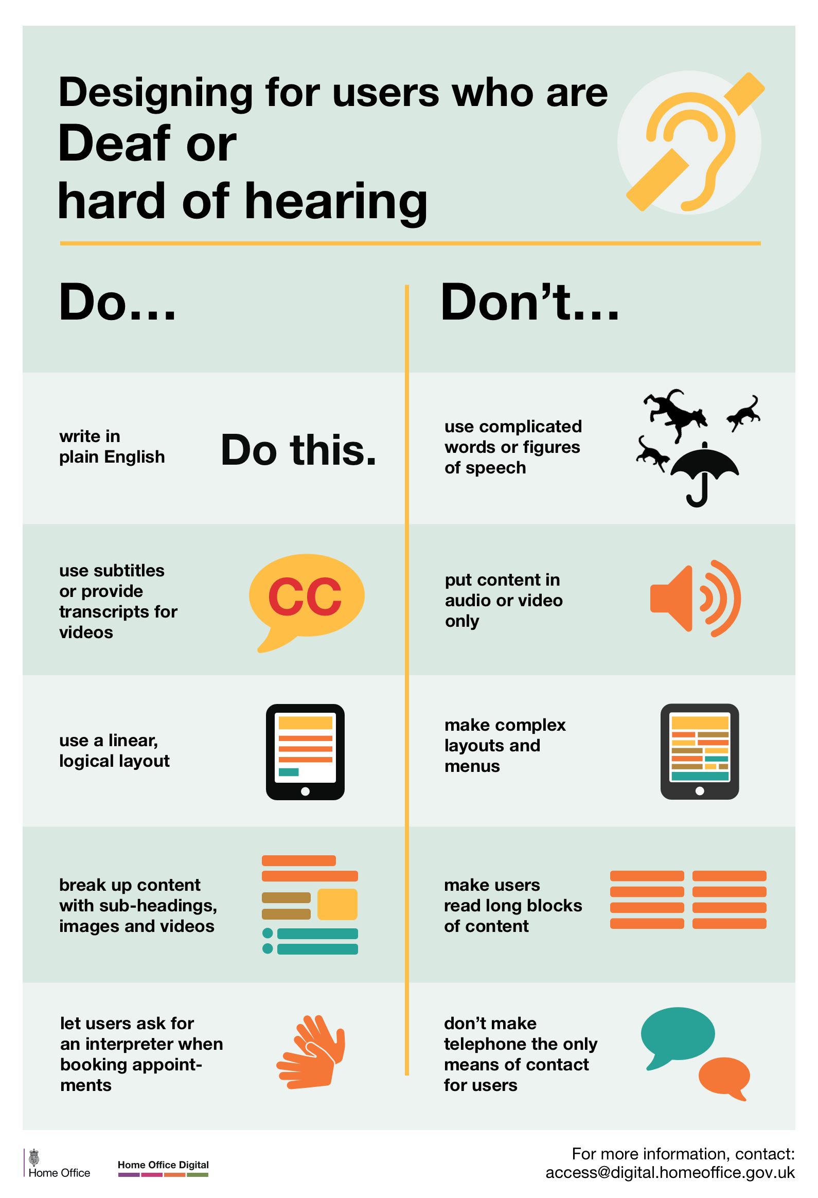
Designing for users who are D/deaf or hard of hearing
Do
- write in plain English
- use subtitles or provide transcripts for video
- use a linear, logical layout
- break up content with sub-headings, images and videos
- let users ask for their preferred communication support when booking appointments
Don’t
- use complicated words or figures of speech
- put content in audio or video only
- make complex layouts and menus
- make users read long blocks of content
- don’t make telephone the only means of contact for users
View poster for Deaf or hard of hearing
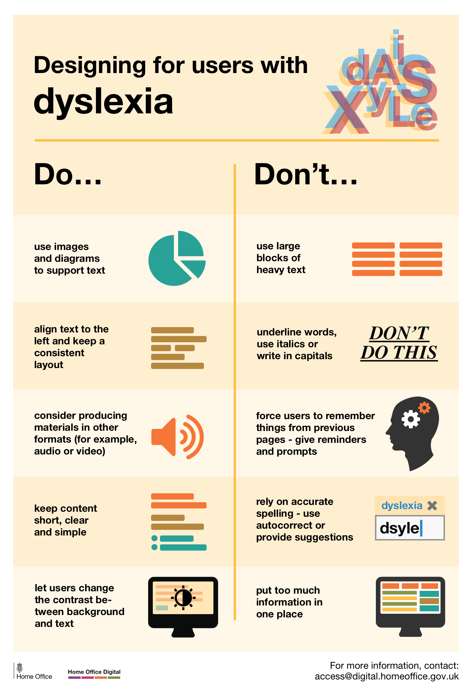
Designing for users with dyslexia
Do
- use images and diagrams to support text
- align text to the left and keep a consistent layout
- consider producing materials in other formats (for example, audio and video)
- keep content short, clear and simple
- let users change the contrast between background and text
Don’t
- use large blocks of heavy text
- underline words, use italics or write capitals
- force users to remember things from previous pages - give reminders and prompts
- rely on accurate spelling - use autocorrect or provide suggestions
- put too much information in one place
Follow Karwai on Twitter and don’t forget to sign up to email alerts.
Resource originally shared via the NPHH Accessibility Facebook Group.
Additional Recommended Resources
- Webinars from RespectAbility including “How to Ensure A Welcoming Lexicon and Inclusive Storytelling” and “How to Ensure Accessible Events”